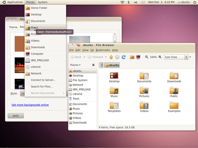
Beginning with the release of Lucid Lynx (10.04 LTS), which is expected to hit PCs at the end of April, Ubuntu's UI will no longer look like it came about as a result of a bad accident in the ladies room. Gone are the days of overly suffocating brown-ness. From here onward, Ubuntu will come in a new theme, called "Light."
The official word was posted on Ubuntu's Wiki. The new theme has more of a professional, 21st century feel to it. However, the overall look and layout of the OS hasn't changed much. The few differences are sure to be welcomed by the Linux community, but many won't think it's enough to push Ubuntu into more mainstream computing.
"The new style of Ubuntu is driven by the theme 'Light'. We've developed a comprehensive set of visual guidelines and treatments that reflect that style, and are updating key assets like the logo accordingly. The new theme takes effect in 10.04 LTS and will define our look and feel for several years."
The decision of branding Ubuntu as "Light" comes from the idea of "warmth and clarity." According to the Ubuntu team, it also gives off the impression of efficiency and quickness. Being that "light is beautiful," so to, Ubuntu needed to be more aesthetically pleasing. Here's what the team came up with:
Logos:

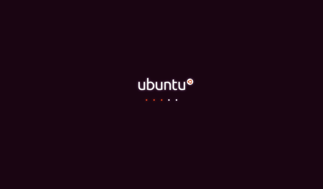
 Boot Screen:
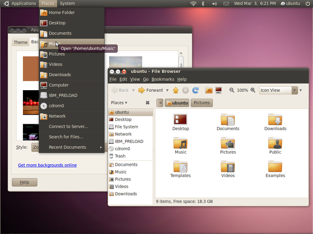
 Desktop (notice the lack of bottom task bar):
The official word was posted on Ubuntu's Wiki. The new theme has more of a professional, 21st century feel to it. However, the overall look and layout of the OS hasn't changed much. The few differences are sure to be welcomed by the Linux community, but many won't think it's enough to push Ubuntu into more mainstream computing.
"The new style of Ubuntu is driven by the theme 'Light'. We've developed a comprehensive set of visual guidelines and treatments that reflect that style, and are updating key assets like the logo accordingly. The new theme takes effect in 10.04 LTS and will define our look and feel for several years."
The decision of branding Ubuntu as "Light" comes from the idea of "warmth and clarity." According to the Ubuntu team, it also gives off the impression of efficiency and quickness. Being that "light is beautiful," so to, Ubuntu needed to be more aesthetically pleasing. Here's what the team came up with:
Logos:


Source LINK
Wow my opinion is really good, it nice look. uBuntu will be future OS that will compete with Mac OS X and Windows 7 with this new themes. Why I said that way, because the original themes may be on uBuntu v9 it still same as feel in Windows XP. (Windows XP is good but not up to date OS with 2010 apps/plug in out gadget this days)

No comments:
Post a Comment